The challenge
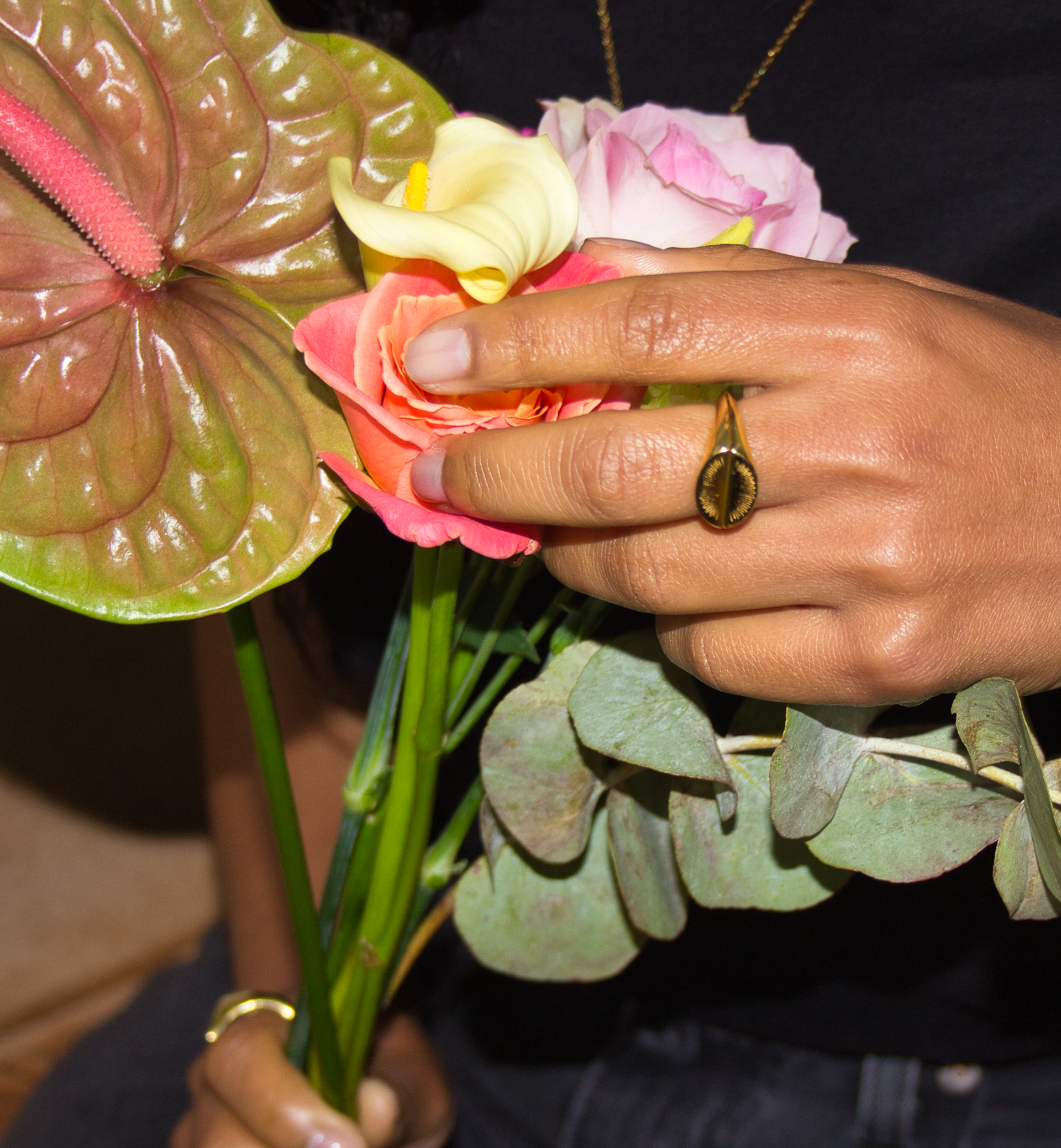
I met Molly, the creator of inpour at my art studio in Woolwich. She wanted to evolve the brand identity of her jewellery business to enable her to move into the 30+ market whilst maintaining a youthful aesthetic. She wanted the identity to include her love of 70s design combined with 90s trendiness. She designs and makes all her jewellery herself, using CAD, hand building and poured moulds. So she wanted some of the process behind her design expressed in the identity.
Process in action
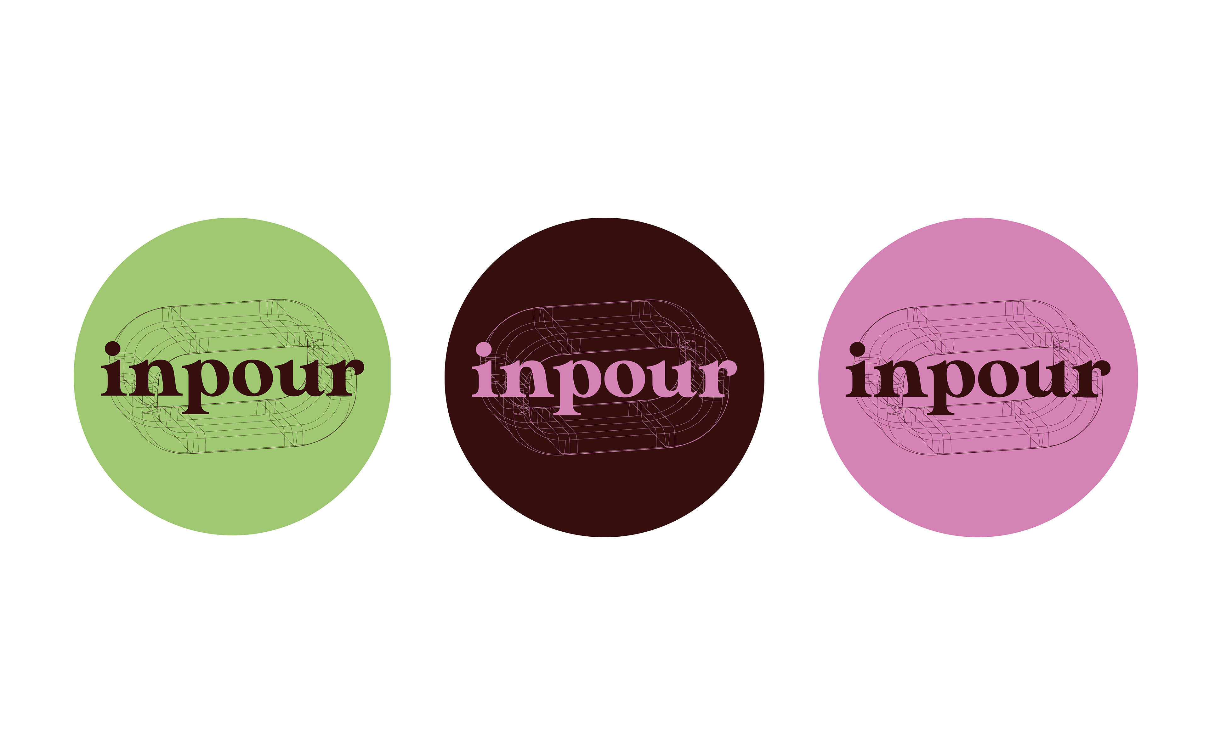
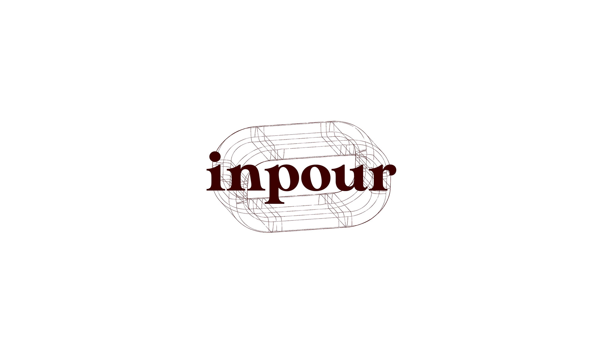
To represent her process I created a wireframe chain link motif, reflective of her wireframe CAD designs. The fineness of the wireframe complimented the existing type lockup adding a feeling of maturity and elegance. This formed the logo and could be applied as a pattern or at scale across any of her touch points.
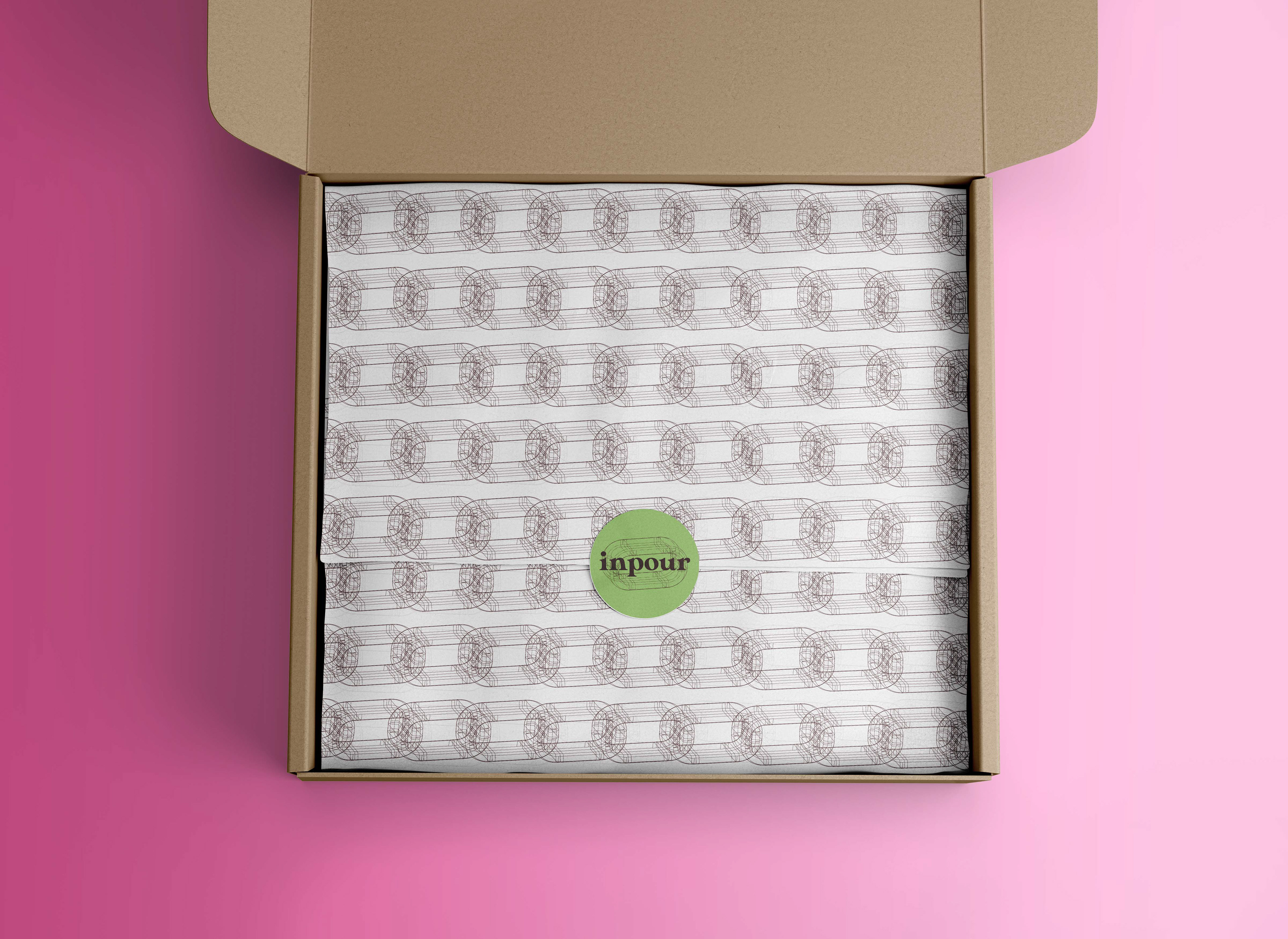
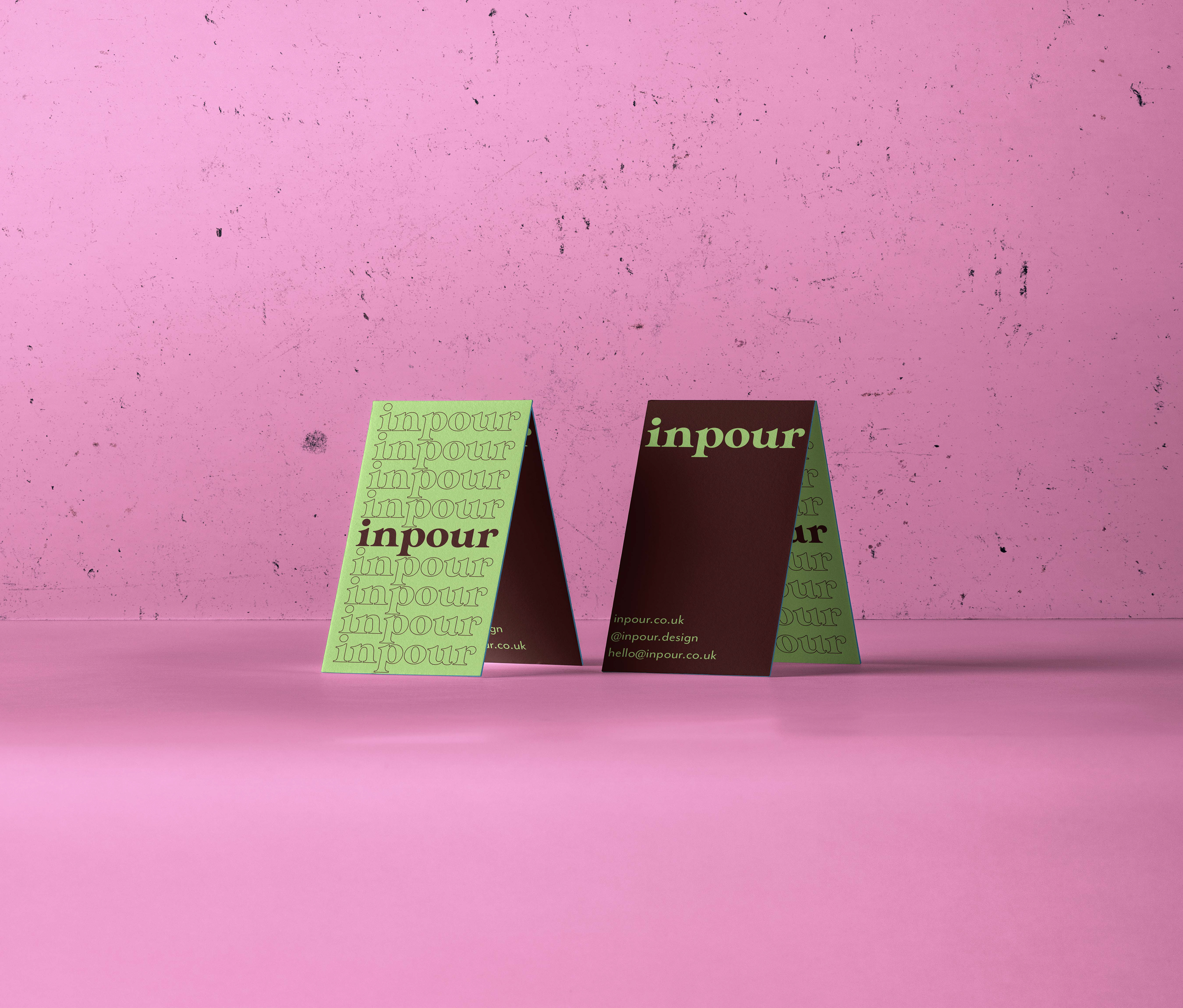
Muted burgundy in the colour palette added a 70s tone to the 90s green and pink creating a vintage yet timeless feel.